Monday, September 24, 2007
digital deliciousness step 4- the final
For those of you just coming in this demo starts from the bottom and you scroll to the top. Still getting the hang of this!
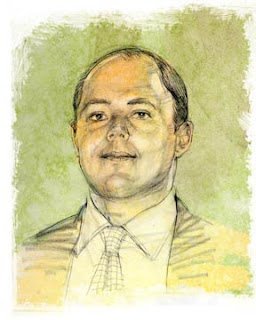
On the last layer, I'll create a 'normal' layer, meaning that it's opaque. I'll use this for highlights and color punches or accents. Sometimes I'll bring in a normal layer but reduce the opacity to 30 percent so it's slightly transparent. Again this just makes it look more organic and not too garish. If it's not clear please feel free to ask for clarity, or offer suggestions. I am always open to learning new tricks.
digital deliciousness step 3
OK, I see as this is going up that it's from the bottom to the top. My apologies.. scroll down a few posts and start at the beginning so you can see how this comes together. Here on the third step I add another clear 'multiply' layer. On this layer I digitally paint away. My favorite brush is a basic brush with edges that I make very large and stroke
Digital deliciousness step 2
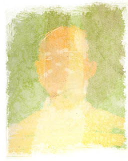
The next step is to bring in the base layer. In this case, I have a library of base textures, and my favorite is a washy loose texture that I had hand-painted and keep as a digital file for layers. I drag and drop the washy file over the drawing, and in new layer I select 'multiply'. This makes it transparent. Using the brush tool i'll stroke a nice painterly edge. I'll also often drag another copy, (multiply later so it's transparent) of the washy layer in and ajust the hue to get different results. It's adding and subtracting.
Digital deliciousness
As promised, here's a series that shows a bit of my digital 'painting' technique. My goal is to give the illustration the same organic and lively feeling that a hand painted piece would have. The best part about digitally working, is the control I have over opacity, value and the ever-handy 'undo'.
I begin with a black and white drawing. To the side, I'll keep the original reference to refer to.
Friday, September 21, 2007
Martha, Moby and more
Hi all,
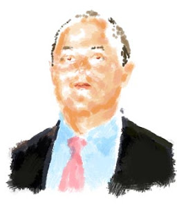
after a brief break I'm back again with a collection of digitally painted illustrations of celebrities I did for Wall Street Journal's weekend 'Hit List'. It's a challenging format, tall and thin, and getting the likeness, posture, etc is a challenge too. I'll do a litttle demo later to show the digital painting process I use. For now, have to go. Enjoy, and feel free to comment!
Tuesday, September 18, 2007
tootin'
Dancing, playing music, sports- movement- it's juicy stuff for an illustrator. I tried to draw what music might sound like coming up and out of the sax. A toothbrush dipped in watery black acrylic, then flicked on the drawing worked great. Then I took that same toothbrush after the spatter dried, and 'combed it' over the fixed charcoal drawing. It gave a nice washy tone that added to the motion. A few drops of gesso for highlights completed the image. It's a risk to take using spattering, etc but those 'accidents' can add a lot to the art.
Another way that is risk-free is to use photoshop. You can create your spatter on a seperate piece of paper, scan it in, and then bring it in as a new layer. In layer options choose 'multiply', and your layer becomes transparent- as if it were glass with paint on it. An excellant way to preserve a drawing yet paint on it. Try layering on top with various opacities, and you can get some very painterly results and color mixing!
Open ends
Hi, back again with the promised figure drawings. Yesterday I had mentioned that keeping areas open can really activate the eye. Also using the line to 'feel' the figure while drawing, lending it weight when the figure leans in, or swooping gracefully over a curve. When I'm in the zone, it's such a free feeling. I just love drawing the figure, or drawing from life- it's great practice and keep the drawing skills sharp.
Back to toot my horn again tomorrow.
Monday, September 17, 2007
Ba-da Bang!
I just read that one of my all-time favorite series, The Sopranos, won an Emmy for Drama, a parting gift as the series has ended. Just what happens to the characters is left to our imagination. That reminds me of what I was taught at Art Center when figure drawing; to not outline or 'close in' the figure. It lends a fluidity and excitement to the eye to give the lines expressive weight and open ends. I'll post some figure work later to point that out better.
Kudos to The Sopranos!
Friday, September 14, 2007
Punching in
Hi all,
My name is Janet Hamlin, I'm an illustrator covering a lot of different beats- courtroom (Guantanamo Bay tribunals, Skakel, etc)
editorial, advertsing, publishing, etc. I thought it would be fun to start a blog and share some of the techniques and experiences I've had.
So I figure my first posting on this blog can start with a bang- my painting of 'The Greatest' Muhammad Ali along with the preliminary value study sketch. Whenever I do a portrait of someone, it's always first and foremost in my mind to pay some kind of homage, bring out the essence of who that person is. Ali's quote "Float like a butterfly, sting like a bee" really says it all- so made that visual. The painting is done with mixed media; charcoal drawing fixed on an illustration board, and gesso to build texture. I then layered the piece with washes, pushing and pulling. After that, sometimes I'll digitally adjust areas or add
some color and enhancement, levels, etc.
If you'd like to see more, check out my site:
http:www.janethamlin.com ( soon to have a facelift and revamping!)
and click the link to my ispot page to see some recent work.
I'll be back...
Subscribe to:
Posts (Atom)