Thursday, December 27, 2007
Inspiration
Nelson Mandela. How or what I could add to describing this man would fall short. I encourage all to familiarize yourself with his life story and you will surely find yourself inspired.
http://www.anc.org.za/people/mandela.html
Saturday, December 22, 2007
Friday, December 21, 2007
Having a ball
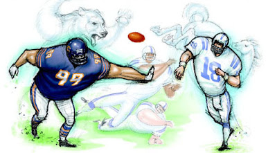
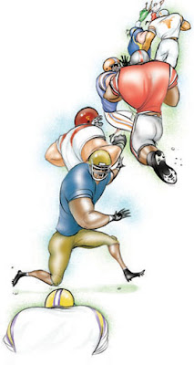
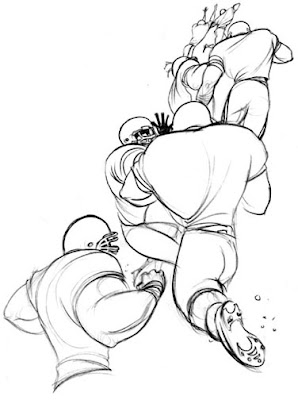
As we close in on the Christmas holiday, many are looking forward to... football! And so today as promised, I'm posting lighter fare. I've included an earlier base sketch so you can see the line art before I digitally painted it. Just a recap, in photoshop; bring the line art in. Create a new layer, and select 'multiply' as the layer option. I then use a combination of the airbrush tool, switching it to 'diffuse' for a spatter look. Layer the transparent colors on top of each other to build it up. When the art is complete, save layered file for backup, then save flattened file for repro.
Have a good weekend!
Thursday, December 20, 2007
Giving and receiving
As the year comes to an end, we begin to tally up and think of taxes.. or not. I thought this image of The Tax Man is perfect. You can't tell if he is giving or taking. Recently our government voted to hold off on collecting the AMT (Alternative Minimum Tax targeted years ago toward millionaires now hitting middle income America) for another year, bringing in a collective sigh of relief from the American middle-class. Tomorrow, a lighter topic!
Wednesday, December 19, 2007
Chicken scratch
Tuesday, December 18, 2007
All for one
I used to illustrate a weekly series by Kitty Oliver that ran in Orlando's paper the Sun-Sentinel, portraying her rich cultural background as well as her experiences as an african-american woman.
I have a mixed-race background that is not obvious, but my mother had many a tale to share about race and class. As a result, any kind of discrimination- be it financial means or cultural history... these are personally passionate topics for me. It's hard not to pass judgements with first impressions- they are powerful. But as a recent phrase I heard said, ' read that book cover to cover'. I'll end with that, and a thank you for stopping by.
Monday, December 17, 2007
Blues
This image reflects how I'm feeling this morning, hearing that one of my favorite musical artists, Dan Fogelberg, has just passed.
I encourage those who are not familiar with his music to check it out- songs like 'Same Old Lang Syne' and 'Longer' are just wonderful, to name but a few. Today, I'll be listening and grateful for artists such as he that grace our lives.
http://www.danfogelberg.com/
Friday, December 14, 2007
Lovely Liz Taylor
Thursday, December 13, 2007
Terminator flowers
As fate would have it, creative expression runs in my family. You may rightfully accuse me of shameless nepotism, but I happen to love my brother Peter Hamlin's art. This piece, entitled 'Terminator Flowers', can be found in American Illustration 26. Much of his work deals with technology impacting organic matter. Treat yourself and let your fingers do the walking to check out more at:
http://www.hambot.com
Wednesday, December 12, 2007
Debt overload
This is a series I did on credit card debt. A timely subject given the pressure to spend for the holidays and the mortgage mess. For those of you overloaded, take heart: there's many things money can't buy. A nice letter, or photo collage, a surprise visit, an offer to help. It's Wednesday.. Friday's around the corner. Have a good one!
Tuesday, December 11, 2007
Dog sketches
I've always had a dog. Sometimes a horse, cat, and fish- but there is no companion better than a dog when you're hiking, walking or just reading a book. It's pretty simple; they're loyal and they love unconditionally. Oh, and they make great subjects to draw, like my old Basset Daisy. Power bars are hard enough for humans to unwrap, but that dog did it in record time when you were'nt looking. Bad, bad dog.. so bad I'll never forget her.
Monday, December 10, 2007
Visions of sugarplums
Saturday, December 8, 2007
Winter warmth
Friday, December 7, 2007
A classic
I'm pulling out a piece I did some time ago because it follows well with the topic of teaching tolerance- not bullying or shaming others, which is what the image depicts. I mentioned re-use earlier in my blog, and 'Shame' was used again on the cover of a magazine targeted toward youth and drug abuse, cropping in on just the front figure. Here we are, friday! Thank you for stopping by and have a good weekend.
Thursday, December 6, 2007
Teaching tolerance
I realized this morning that my blog need not always be about my work. Last night I was having a great conversation with my friend Nina Frenkel, amazing artist and illustrator. Not too long ago she worked on a series of pieces for educators to use, teaching students about accepting eachother, bullying, differences, etc. commissioned by The Southern Poverty Law Center, a wonderful organization and proof of the power of art to bring across positive messages. Nina's site:
http://www.ninafrenkel.com
And Southern Poverty Law Center:
http://www.tolerance.org/teach/resources/index.jsp
Wednesday, December 5, 2007
Cover story
From sketch to final, the process of a book cover. I also liked the one with the scarf trailing, not chosen because the character was not as passive as that cover suggested. I'll probably find another project for that sketch. Many times I've done art for one thing and clients paid to re-use elsewhere. More on that later. Happy wednesday!
Tuesday, December 4, 2007
Change it up
For a few years I worked on staff illustrating for Associated Press. There were several vastly different topics to illustrate and while I have a definite 'homestyle' I loved using different styles of working, like this and some earlier examples in the blog of caricatures. In this case, the article was about young Jewish culture countered by the older conservatives- and a light approach was a good angle to take. A humble nod to Al Hirschfeld, the one and only Line King.
Monday, December 3, 2007
Musical houses
A recent illustration I did about how the mortgage crisis is forcing more people to sell- and then need to rent. With so many looking it makes finding a rental house tough, so I came up with the concept of 'musical chairs'. Anyone that's looked for a rental in the NY area knows that this is exactly how it can feel- a big rush and race to find your place. I kept it kind of loose and stylized so I could really play off the movement in this one.
Friday, November 30, 2007
Lone wolf
This is a painting I did for a series on various wildlife in Long Island. It's painted traditionally with acrylic. To get the soft haze around the wolf's head, I painted water around it, then lightly dipped the color along the edges, allowing it to bleed out. It's a beautiful effect. For texture, you can toss salt on it. Excellent backgrounds for digital paintings too- do it on a blank board, save, and drop in as a layer in photoshop.
Recently I went from working in a group environment back to a solo studio. With the internet you're not really working in a vacuum anymore- there are tons of tools, visual inspiration, links and connections. Here is a site a friend of mine who used to teach at Dreamworks sent me- a portal to several tutorials and notable sites:
http://multimedia.vg/other.htm
enjoy!
Thursday, November 29, 2007
Hail Caesar
Wednesday, November 28, 2007
Tangled up
Tuesday, November 27, 2007
From the heart
This piece is on AIDS and health clinics in Africa. People will travel for miles, often waiting in long lines. In this case the space I had to work with was very defined, so I had to come up with a composition that would show that line but also keep the clinic as a focal point; I think I succeeded to a degree here. Suggested reading: 'What is the What' edited by Dave Eggers. Check it out:
http://www.mcsweeneys.net/books/whatisthewhat.html
Monday, November 26, 2007
Twixt and Twain
Here is a piece I did that ran this past weekend, about the lost works of Mark Twain making it to Broadway, hence the spotlight on stage. I painted this traditionally and then digitally dodged and burned to push and pull areas. The shading was created on a separate layer in photoshop choosing the layer style 'multiply' which makes that layer transparent. This allowed some of the texture from the background to show faintly. The other option is a normal layer, adjusting the opacity- sometimes you end up with a 'fogged' effect as opposed to a completely clear layer. Upon finishing, layer should be flattened and saved as tiff or jpg.
If any of this is unclear (no pun intended) feel free to post me for clarification. Happy Monday, all!
Saturday, November 24, 2007
To the birds
Wednesday, November 21, 2007
Creative process
Here is another example of sketching through ideas until you find the one that works best for you and the client. In this case, I started with a couple; and then we decided a person of color, centered and running, would be the perfect dynamic for a heart-healthy focus. I found a palette of colors that I thought would work well for a winter-health topic. This particular piece was part of a series I did for the New York Times- health insert in the magazine called 'Cause to Cure'.
Tuesday, November 20, 2007
An inside day
Monday, November 19, 2007
Sketching ideas
This illustration accompanied and Op-ed article about the freedom to display religion publicly. In this case, the story cited the example of a Buddhist mediation walk that took place in several street locations in NYC. Immediately I imagined the scene of bustling NY pedestrians like a river swirling around this lone figure. Other ideas were to show religious symbols, not quite as strong visually but still something to explore. The top image is the final, and sketch ideas run below.
Friday, November 16, 2007
Barry Bonds
I did both of these Barry Bonds illustrations for the Associated Press; when he surpassed The Babe's and Hank Aaron's records. Hallmark efforts cautiously celebrated. Bonds is an easy mark for an illustrator to run with visually. It will be interesting to see if he'll end up behind the bat- or the bars.
Subscribe to:
Posts (Atom)